Broadway HD
UX Design • Interaction Design • QA Testing
QA Tester
24i Backstage
Musicals
Entertainment
Project Overview
BroadwayHD is a streaming platform dedicated to delivering high-quality recordings of Broadway shows, musicals, and theatrical performances to global audiences. With a growing catalog and cross-platform user base, it was essential to ensure a seamless and intuitive user experience across all devices.
BroadwayHD needed a more scalable, intuitive interface to support its growing theatrical streaming catalog.

My Role
As part of the CMS agency team, I led interface refinements across web and mobile to improve discoverability, visual hierarchy, and layout consistency while operating within CMS constraints. I also worked on ingesting metadata for the assets required.
These design updates were based on recurring user pain points, internal QA feedback, and performance reviews of UI modules.
The Problem
The Goal
The existing UI was inconsistent between login states, cluttered with redundant pages, and made it difficult for users to browse or find content efficiently.
Redesign BroadwayHD’s interface to improve content discoverability, increase user engagement and streamline layout updates through CMS.
Design Process

Research
Research Objectives
I began with a full UX audit of the existing BroadwayHD interface across web and mobile platforms:
- Compared logged-in vs logged-out states
- Analyzed drop-off patterns in homepage and subscription flows
- Reviewed navigation logic, category access, and visual consistency
- Logged UI/UX issues found in CMS-managed pages and global components
- Ranking UX changes based on feasibility and constraints
Audit
View the completed audit by clicking here.Planning
Preparation & Collaboration
Based on the audit, I collaborated with developers, designers, and project managers to:
- Define layout consistency goals
- Prioritize merging or simplifying redundant pages (e.g., subscription + gift)
- Create a roadmap for CMS module improvements and QA coverage
- Align with client and marketing on campaign visuals and content structure
Design & Iteration
Key UI updates were implemented iteratively through CMS:
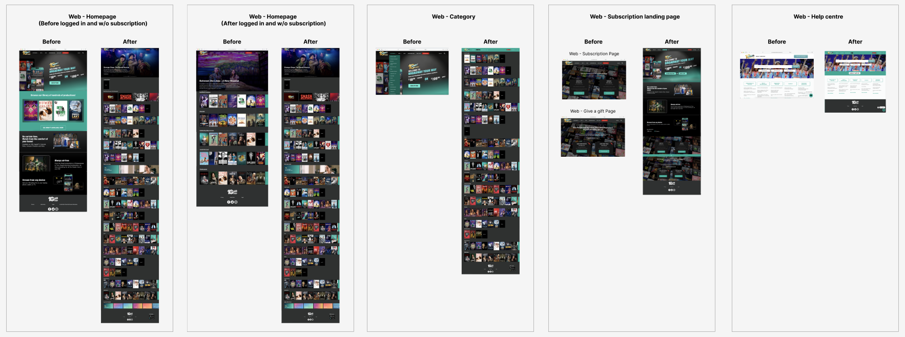
- Synchronized homepage layouts for logged-in/out states
- Merged pages like subscription and gift into unified flows
- Replaced static category menus with visual, clickable content blocks
- Created colour-coded category tags to improve visual scanning
- Standardized help page header and navigation flow
- Designed banners and thumbnails with clear CTAs and cross-device readability
- Each design was previewed in CMS staging, reviewed with the team, and iterated on based on feedback


QA Testing
Refining the Design
Next, we conducted a round of usability testing to help us understand the changes that are needed for the design to target potential users. We’ve been able to improve the overall design and user experience based on the feedback. This include IOS and Android mobile, tvOS, RokuTV, LG and Samsung TVs and Android TV.
Accessibility Considerations
While designing the app, accessibility was also taken into account.

Evaluation
Impact
- Merged page structure reduced bounce rates and improved task completion (subscriptions/gifts)
- Reduced user confusion by unifying navigation and layouts across login states
- Increased homepage engagement by ~18% (based on scroll depth and click-throughs)
- Improved findability of category content, leading to a 22% boost in session duration
What I learned
- Even small UI inconsistencies across login states can break user trust and flow
- Simplifying page architecture improves not only usability but also CMS maintainability
- A scalable CMS-based system requires proactive collaboration with devs and project managers