UX Research • Interaction Design • Responsive Design • Rapid Prototyping
Lifely is a mental health app that provides tools to manage users’ mood. It tracks down the user’s emotions, thoughts and encourages users to check in with their mood, write reflections, and journal. The purpose of Lifely is to emphasize on people’s well-beings and helping them through the journey.
01.
Select your goal to form personalized recommendations.
02.
Explore various mindfulness exercises that are effective for managing stress, mood, and anxiety.
People who suffer from mental health disorders lack helpful and accessible resources for themselves.
The goal of this project is to design a user-centered app which provides actual tools or features that are useful to users who are suffering from mental health issues and mood swings.
A key challenge was identifying the user pain points and addressing them effectively. In order to help people who have trouble managing their moods and motivate them to continue their healing journey, it was very crucial for me to understand what the real users needs are for a mental health app.

The purpose of conducting research is to:
I first looked into some data on mental health to help me stayed unbiased and gain a deeper understanding of the problems and demographics.
The research revealed that young adults aged from 18 to 25 years old have the highest prevalence (30.6%, figure 1) of mental health issues out of 52.9 million people, followed by the 26 to 49 years old age group (25.3%, figure 1). But the age group of 50 years old and above have received mental health services the most (48%, figure 2) out of 24.3 million people.
Figure 1Figure 1 shows the past year prevalence of AMI among 52.9 million U.S. adults.

Figure 2Figure 2 shows data on mental health services received by adults with any mental illness (AMI) in the United States 18+ over the past year (2020). NSDUH defines mental health services as inpatient treatment/counseling, outpatient treatment/counseling, or taking prescription medication for emotional, nervous, or mental health issues.
Source: https://www.nimh.nih.gov/health/statistics/mental-illness
The research shows that adolescent, and young adults are more likely to develop any mental illness (AMI) ranging from mild to moderate. Figure 2 in the research also shows that older people are more likely to seek therapy or counseling.
I then researched the types of mental health treatments and learned about Cognitive Behavioural Therapy (CBT). Research has shown that it is an effective psychotherapy treatment that can be used to treat a range of mental health disorders, including depression, anxiety disorders, and eating disorders. CBT is the most popular and effective approach to improving mood and positive thinking by putting an emphasis on self-help through sessions of mindfulness exercises.
The benefits of CBT are:
Image: https://creakyjoints.org/mental-health/cognitive-behavioral-therapy-for-arthritis/
Source: https://www.apa.org/ptsd-guideline/patients-and-families/cognitive-behavioral
http://comprehendthemind.com/7-benefits-cognitive-behavioral-therapy/
Next, I conducted user interviews with 5 people in different age, gender, and race to have a diverse perspective and validate the research. It helped me to identify the target users and their needs.
I wrote a script and left the questions open so that participants could share their experiences with mental health services. Interviews were conducted using a semi-structured interview process, which provided more insight into participants' thoughts and feelings.
I then learned that many users couldn't afford therapy or they need a way to stay motivated to achieve their goals. So a primary user group identified through research was young adults, workers, or individuals who do not have that many resources to seek therapy or having someone willing to listen unbiased. The user group fit into the initial assumptions about Lifely’s users. Through research, it revealed that budget was not the only factor of limiting users from seeking therapy. Other problems such as fear of judgement, lack of confidence and commitment, etc.

Having gathered all my research, I found that there are three factors that cause pain points for users, which are effectiveness, cost, and reliability.
I created two personas based on the insights that I gained from the interview participants.

Andrea is a law student who needs an affordable and accessible way to manager her emotions and alleviate stress.

Harvey is a financial advisor who needs an efficient way to improve and track his mood everyday while receiving the help of therapy.
Then I created a user journey map of Andrea’s experience of navigating through the app to help identify user emotions and improvement opportunities.

After learning about the user pain points and needs, I analyzed some existing mental health apps to help me understand the expectations.
*Please click on the links below to see each analysis.
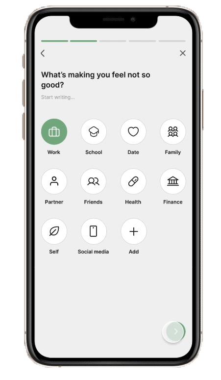
The user flow demonstrates a straightforward process of completing exercises on the app.
Based on the research, it is recommended to take strategic actions:

I then visualized the concepts with wireframe sketches for each screen, keeping in mind the user's pain points in terms of navigation, designs, and accessibility in different variations on both mobile and tablet devices.

By working from sketches to digital lo-fi wireframes, it has been easier to create a mental health app that can address user pain points and meet user needs. As part of my strategy, I prioritized easy-to-read visuals, effective mindfulness exercises, and friendly communication with users.
Mobile
Tablet
For the low-fidelity prototype, I linked all of the screens involved in completing the mood check-in each day. By doing so, I was able to focus on designing the layout and navigation before moving forward.
Then I conducted a round of usability testing too see if my concept was meeting the user needs.
Based on the usability testing findings, I refined the design to meet the user needs.
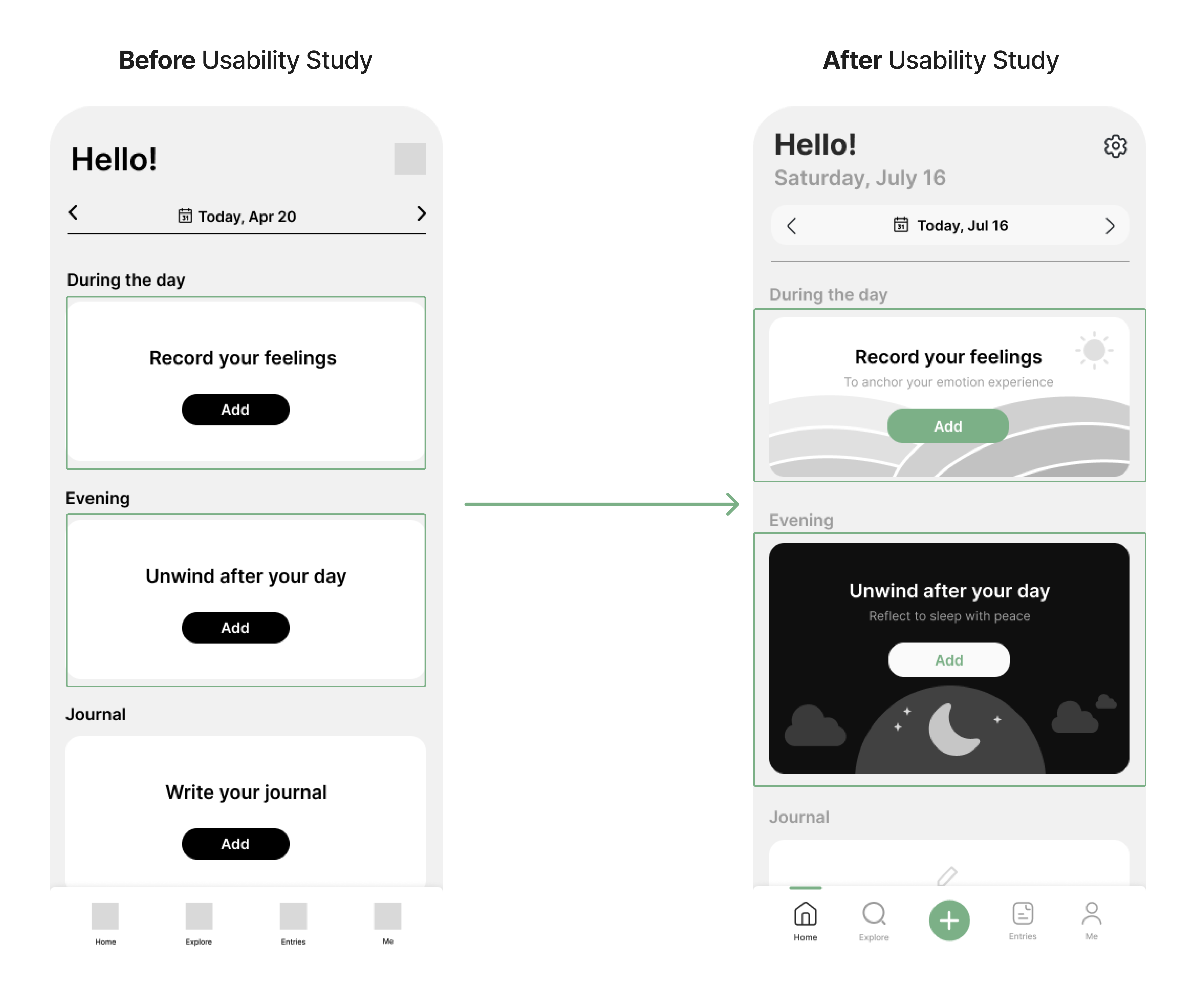
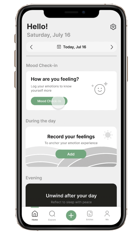
Home Screen
After the usability testing, I decided to incorporate visuals inside the widget to reflect the context of each mindfulness exercise and also encourage users to complete them.
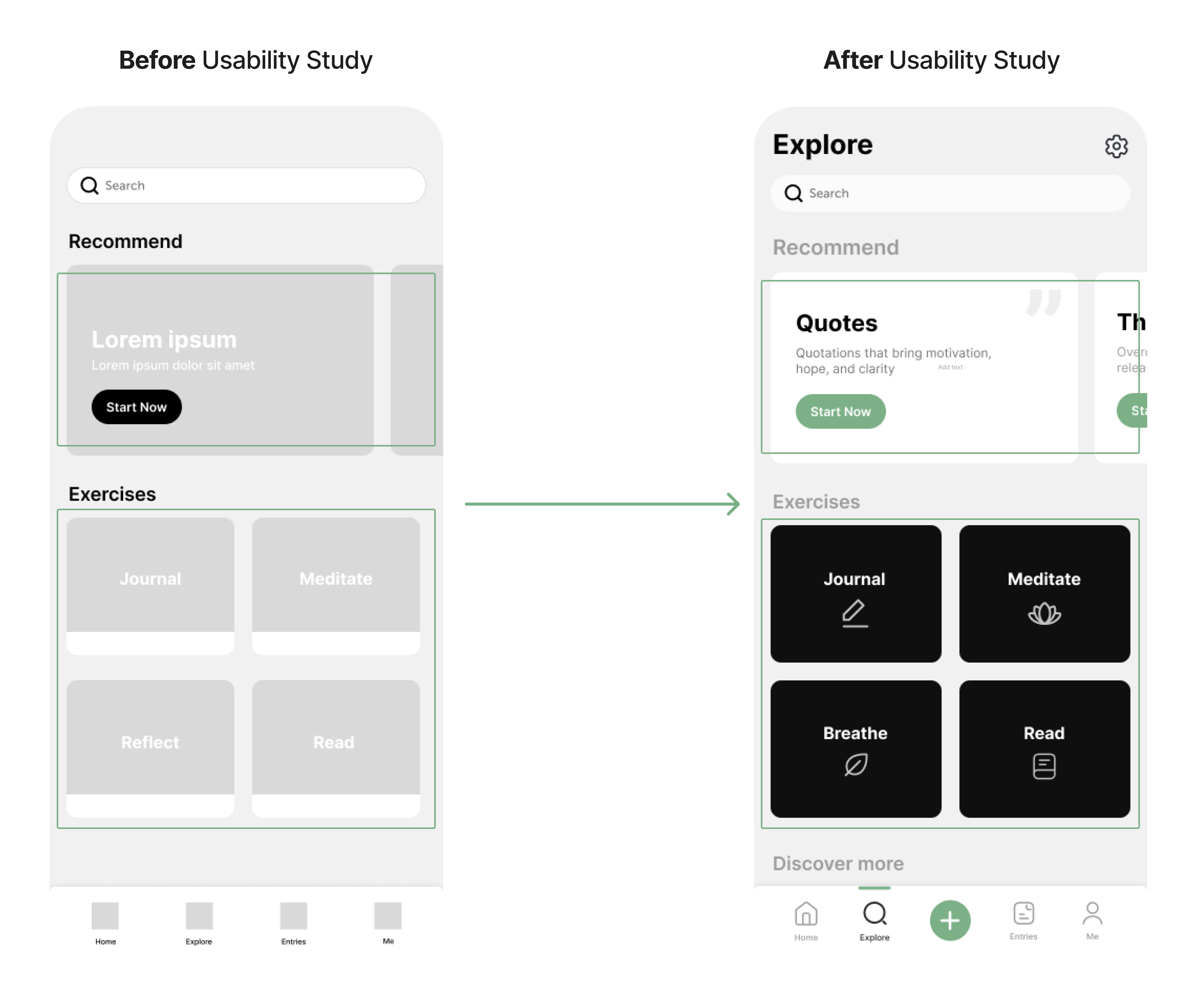
Explore Screen
On the explore screen, users are recommended by the features that would help manage stress and anxiety. Icons were added for each exercise to create a more intuitive and straightforward flow.
I also updated the additional screen size for users to access on their tablet.
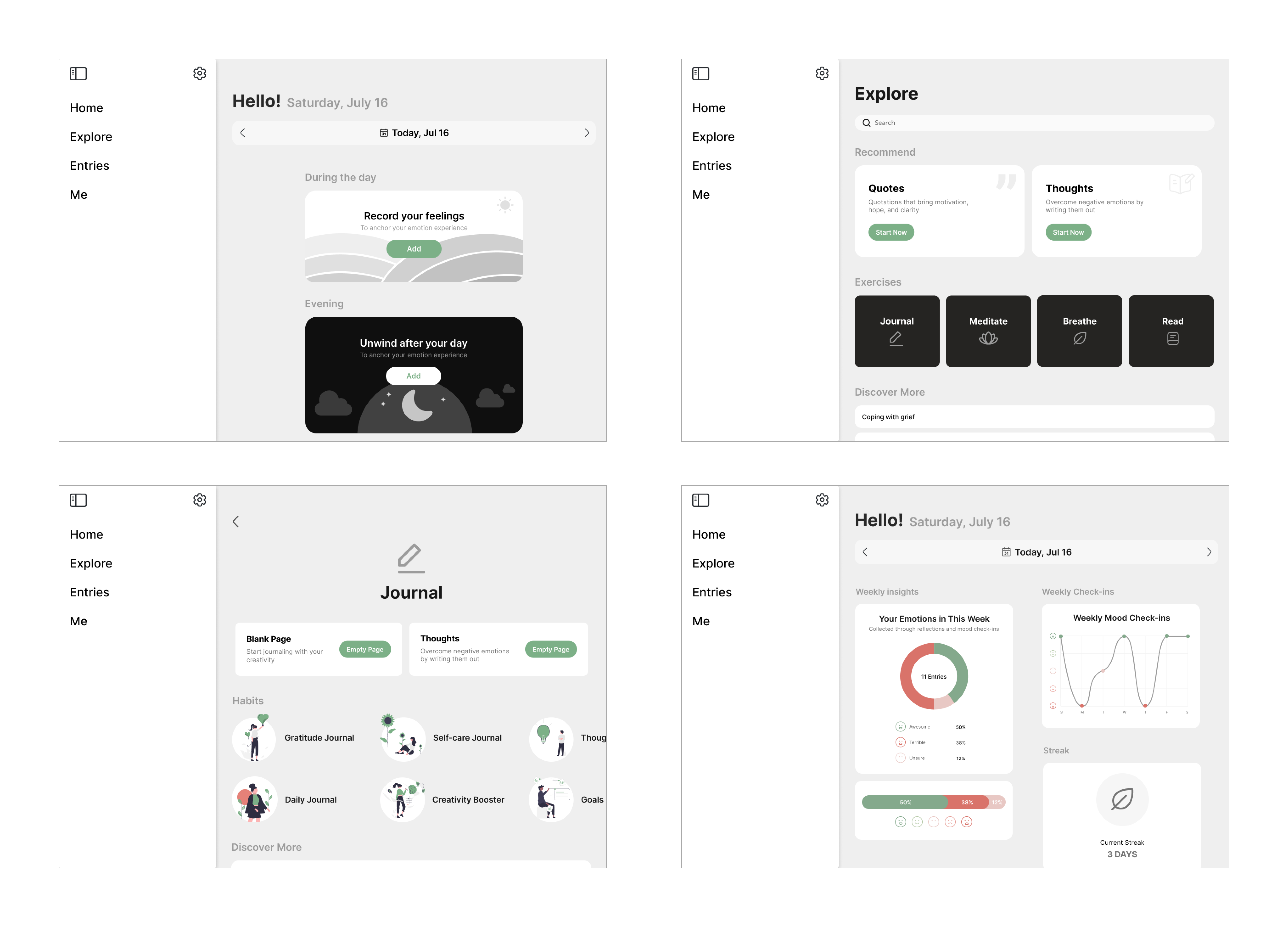
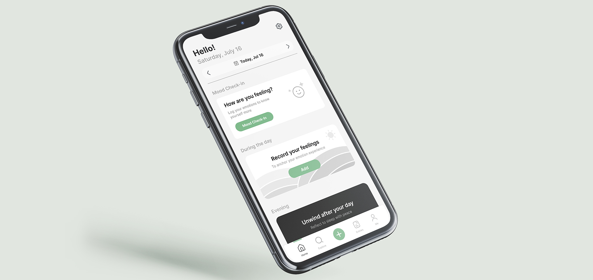
The initial high fidelity prototype demonstrates mood check-in and mindfulness exercise flow on both mobile and tablet inputs with clean layouts, visual hierarchy, and accessibility considerations.
The user can begin mood check-in on home screen, search for mindfulness exercises on explore screen, and track their emotions by the statistics provided.
Mobile
Tablet
I conducted another round of usability study to help me further understand the changes that could be made to improve the overall user experience and design.
Here's what I found:

Based on the second round of usability testing findings, I continued refining the design to meet the user needs.


Home Screen
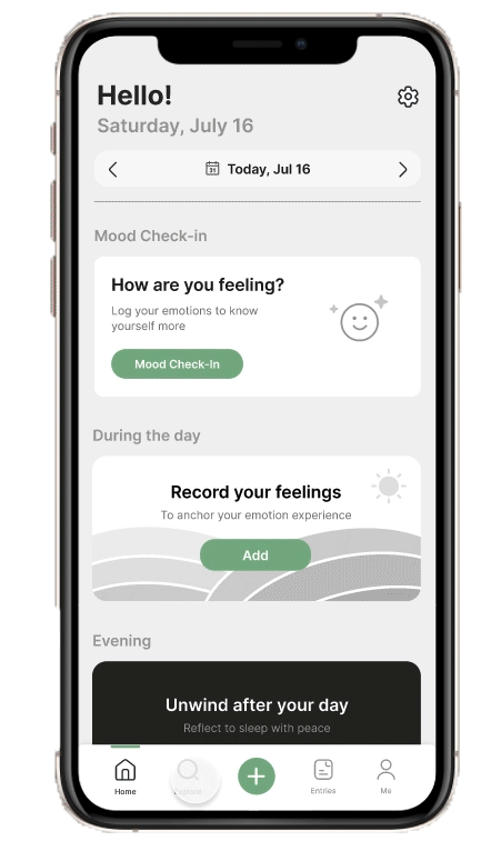
Based on the usability testing, I made the daily mood check-in more easy to see when users enter the app.
Completion Screen
I included an illustration on the completion screen in order to motivate users for continued use after completing an exercise.
OnboardingBased on the feedback that I received from the usability testing, I added an onboarding process to increase user trust in the app. This was done by explaining what CBT is, and its effectiveness according to studies, as well as to reinforce brand recognition.
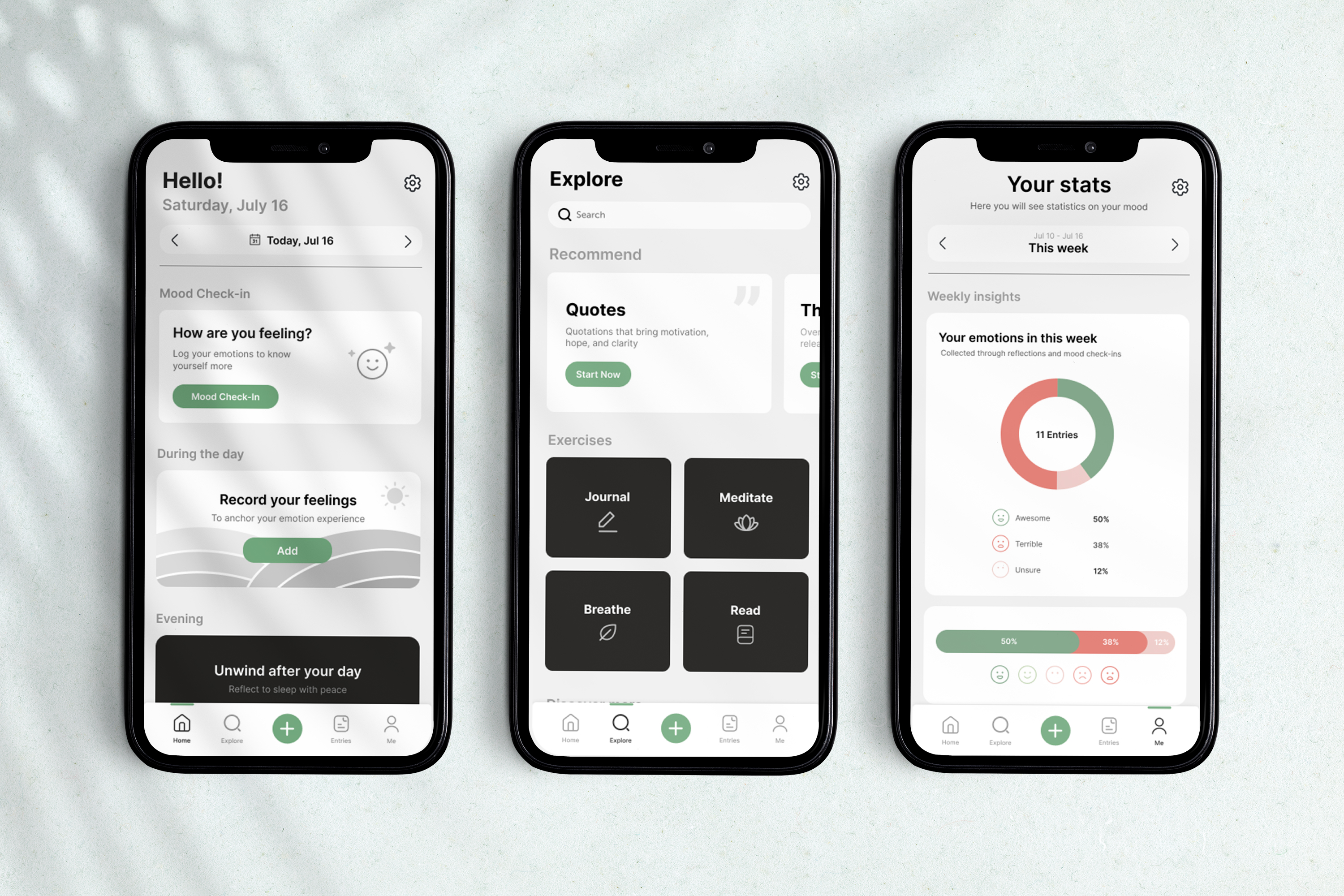
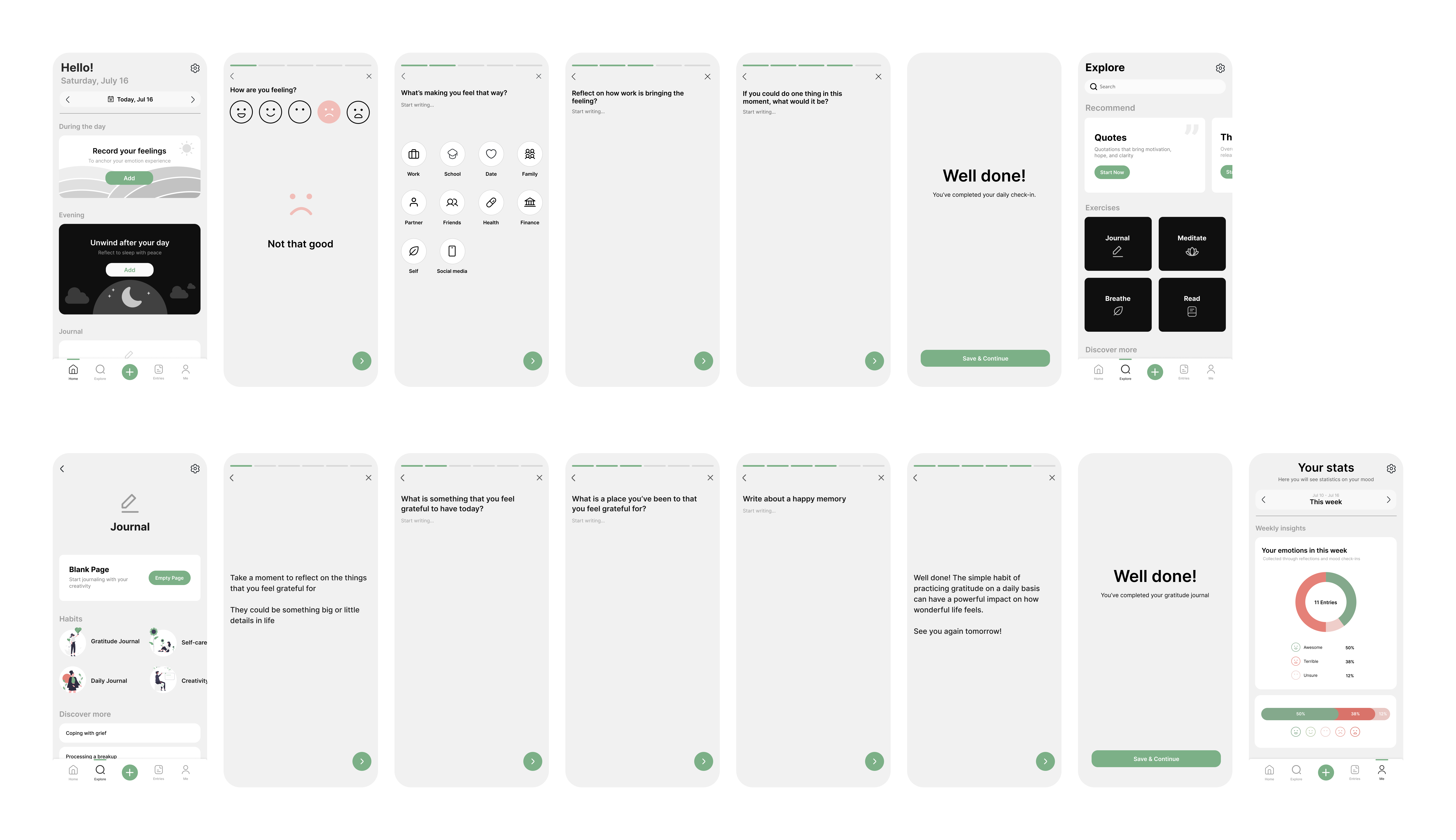
The final prototype consists of clean layouts, intuitive visual supports, and informative design to help users navigate the app easily and be useful to users for continued use.
Mobile
Tablet
01.
Complete daily mood check-in easily on the home screen.
02.
Complete the given prompts.
03.
Explore different mindfulness exercises to manage stress, mood, and anxiety.
04.
Users can easily track the statistics regarding their emotions and spot a trend.
During the design of the app, these accessibility aspects were considered.

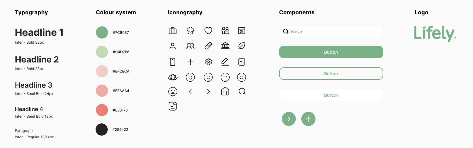
When deciding the visual style of the app, I kept in mind that Lifely should be approachable and encouraging. Therefore I created a design system that demonstrates simplicity and well-being with green as the primary colour and a modern typeface.
I'm very happy with the results of Lifely, but iteration and improvement are always a huge part of the design process.
Another follow-up usability testing would be beneficial to investigate potential improvement opportunities for the app.
A key feature of Lifely is incorporating exercises in the app to help users understand the importance of developing positive thinking and behaviour. It would be helpful to identify additional features and practices that can be added to the app.
My goal was to make the project user-centred and I've learned a lot from it.
Users shared that the app provided an accessible way to connect with yourself in different ways. And useful tools to fully engage and track emotions.
One quote from user feedback: “The app is very informative and easy to use. It encourages you to reflect and ask yourself questions about what you really think. It’s a great tool for people who can’t afford therapy.”
Making design decisions that could potentially influence more users than I anticipated has always been challenging for me. This time, I learned to have a just-do-it attitude and used my instincts as a designer along with what I learned from the user to get things rolling quickly.