UX Research • User Strategy • Visual Design • Responsive Design
Oak and Fort is a clothing brand that offers stylish yet affordable clothes and accessories. They provide economical pricing options and their target customers are mainly young adults and working professionals between 16-40 years old. Their mission is to make clothes shopping accessible and affordable.

01.
Explore different categories of stylish clothes.
02.
View the product with a detailed description and personalized recommendations.

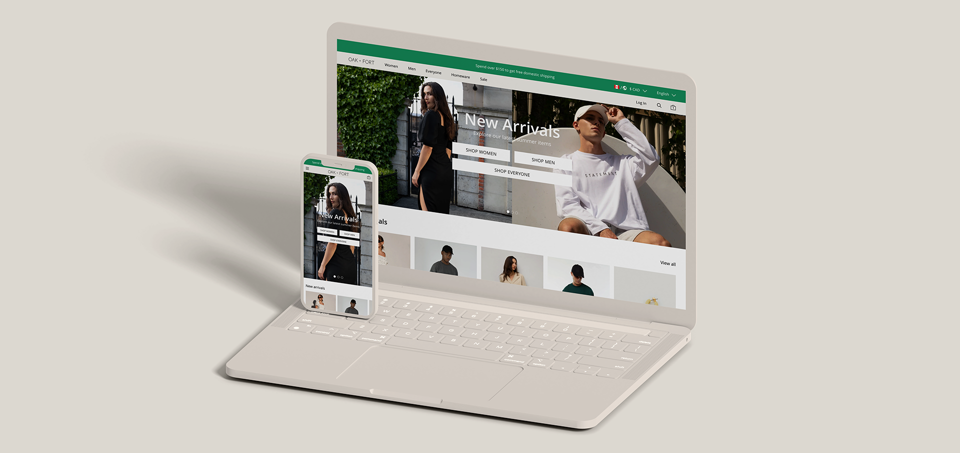
The existing online shopping website has cluttered and inconsistent designs, insufficient user experience, and frequent technical errors.
Redesign the Oak and Fort website to be user-centric by providing clear navigation, considerate features, easy-on-eyes visual design, and offering an easier checkout process flow.
The core challenge was to identify user pain points and optimize the website to provide a better shopping experience. My goal was to understand the issues with the existing website by conducting user research to spot necessary changes and meet user needs with design iterations.

The purpose of conducting an interview is to:
I conducted interviews to understand the ongoing user pain points of my target user group better with people who are familiar with the Oak and Fort website or similar services.
So I came up with a script and kept the questions open enough for the participants to elaborate on their experience with the services. The interviews were done in a semi-structured interview process, which allows me to gain additional insights into the participants' feelings.
I learned that many users were having difficulties interacting with the existing website, such as cluttered design, mandatory login to checkout, etc. Users' frustrations would make an otherwise enjoyable shopping experience challenging for them, defeating the purpose of providing a positive user experience.
In order to figure out the improvements that are needed on the existing website in detail. I also conducted a round of usability testing in which users were asked to perform a series of tasks such as completing the checkout process and adding a product to the cart on the Oak and Fort website.
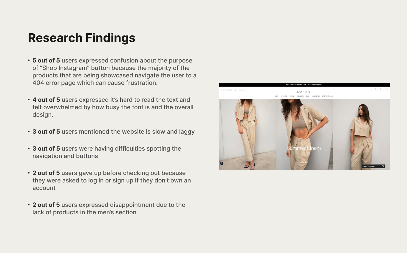
Here are some findings:
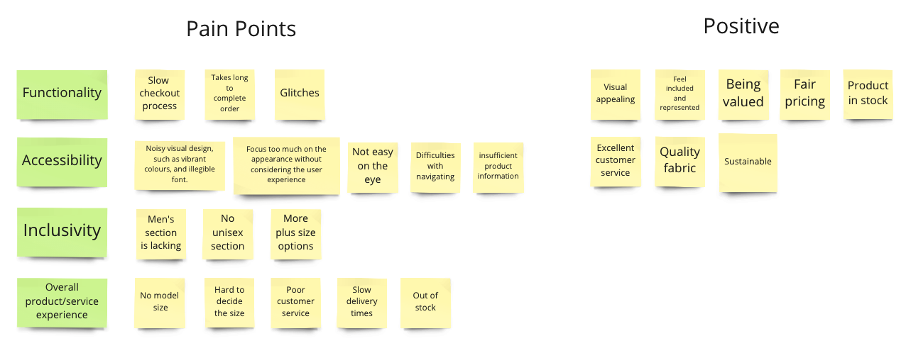
Through the research, I've discovered that there are three factors that cause pain points for users, which are accessibility, inclusivity, and experience.
I then created two personas based on the research insights into the shopping experience for the target market.

Emma is an HR manager who needs a way to make online shopping more smooth and efficient for her.
Noah is a medical student who needs an inclusive and easy online shopping experience to enjoy the happiness from buying affordable and cute clothes.
I created a user journey map of Emma’s experience of shopping on the site to help identify possible pain points and improvement opportunities.
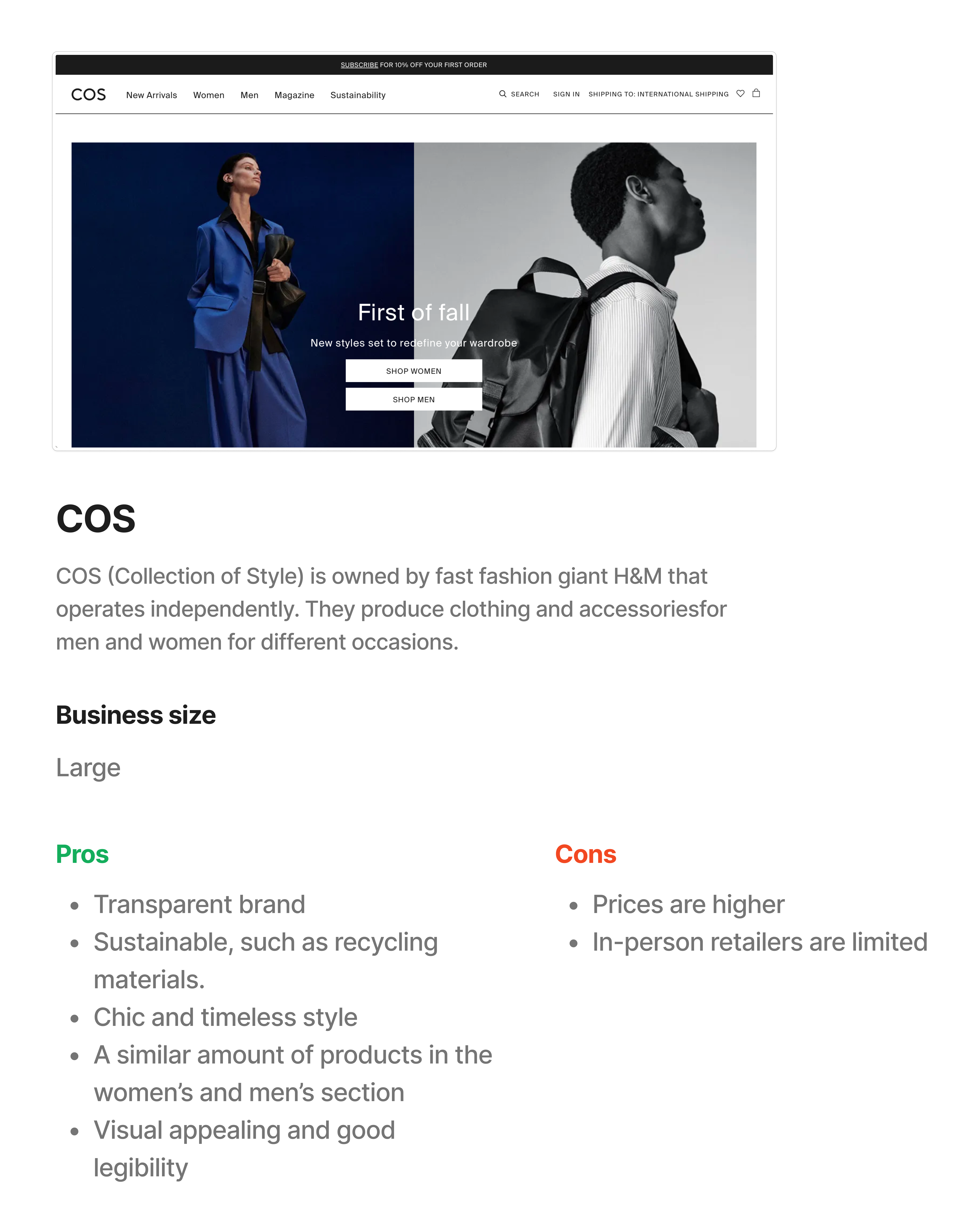
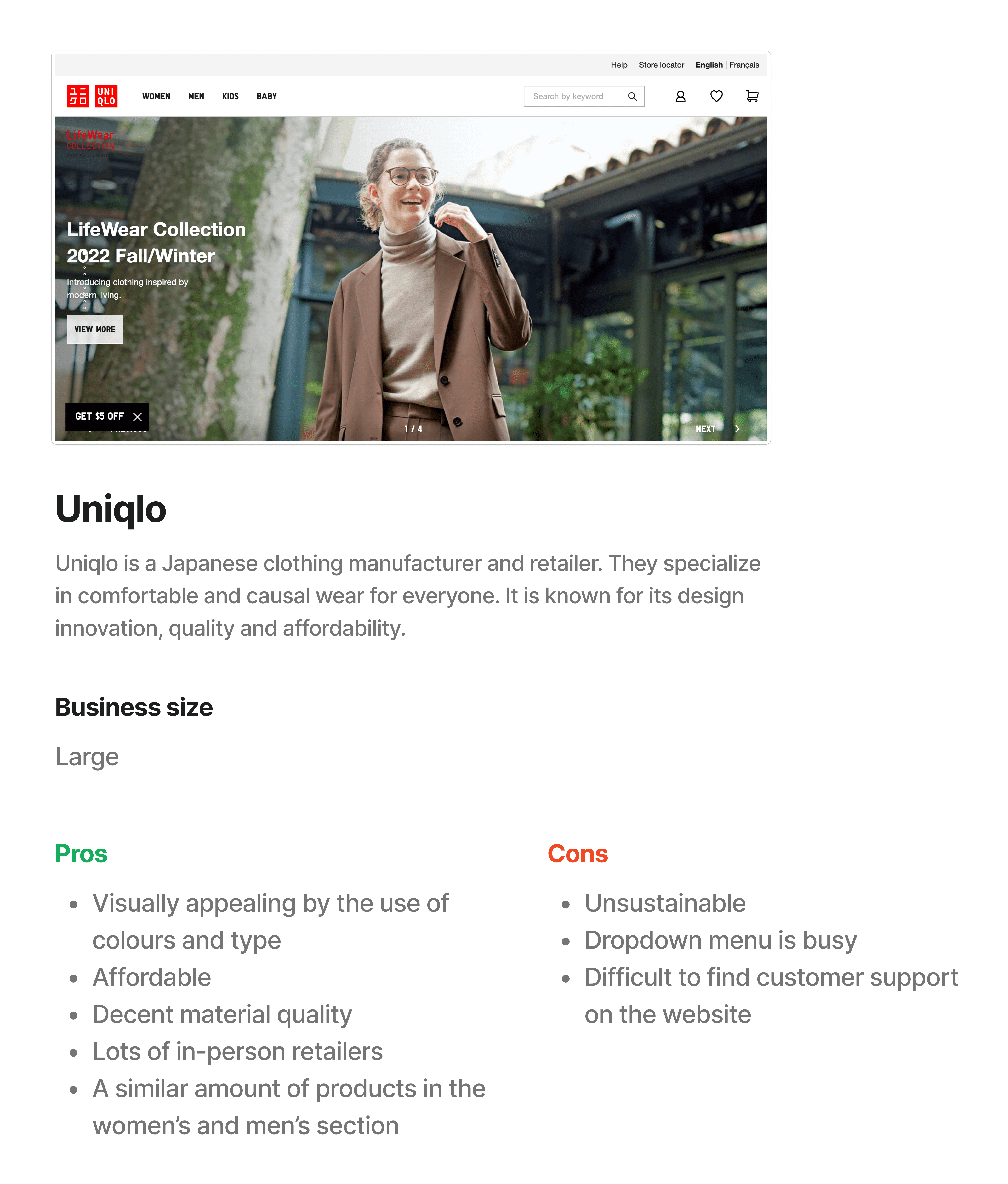
Now that I have knowledge about the user pain points and needs, I looked at some existing brands that are similar to Oak and Fort and analyzed them. I picked some popular brands in the fashion industry.
*Please click on the links below to see each analysis.
Frustrations with website navigation were one of the primary pain points for users, so I took that into consideration and created a sitemap. I wanted to improve the overall navigation of the website by making the information clear and easy to understand.
Before getting into brainstorming ideas, I outlined some of the changes that are needed for the current website based on the research insights and my knowledge as a designer.
Next, to visualize the ideas, I first sketched out different variations for each page. For both desktop and mobile devices, I kept the user's pain points in mind regarding navigation, design, and accessibility.
Next, I moved into developing the concepts and the process of creating digital wireframes from sketches has made it possible to address user pain points and find solutions. I prioritized easy-to-read visuals, legible navigation, and typography to facilitate easy navigation.
Desktop
Mobile
In order to create the low-fidelity prototype, I linked all screens involved in the shopping process. In this way, I was able to concentrate on designing the flow, the layout, and the navigation before moving forward.
Desktop
Mobile
Drop Down Menu
Based on the insights and feedback from the usability study. Changes were made to improve accessibility. I added visuals and CTAs to the drop-down menu so that it is easier to read for users. This allowed them to have somewhere to look at and navigate.

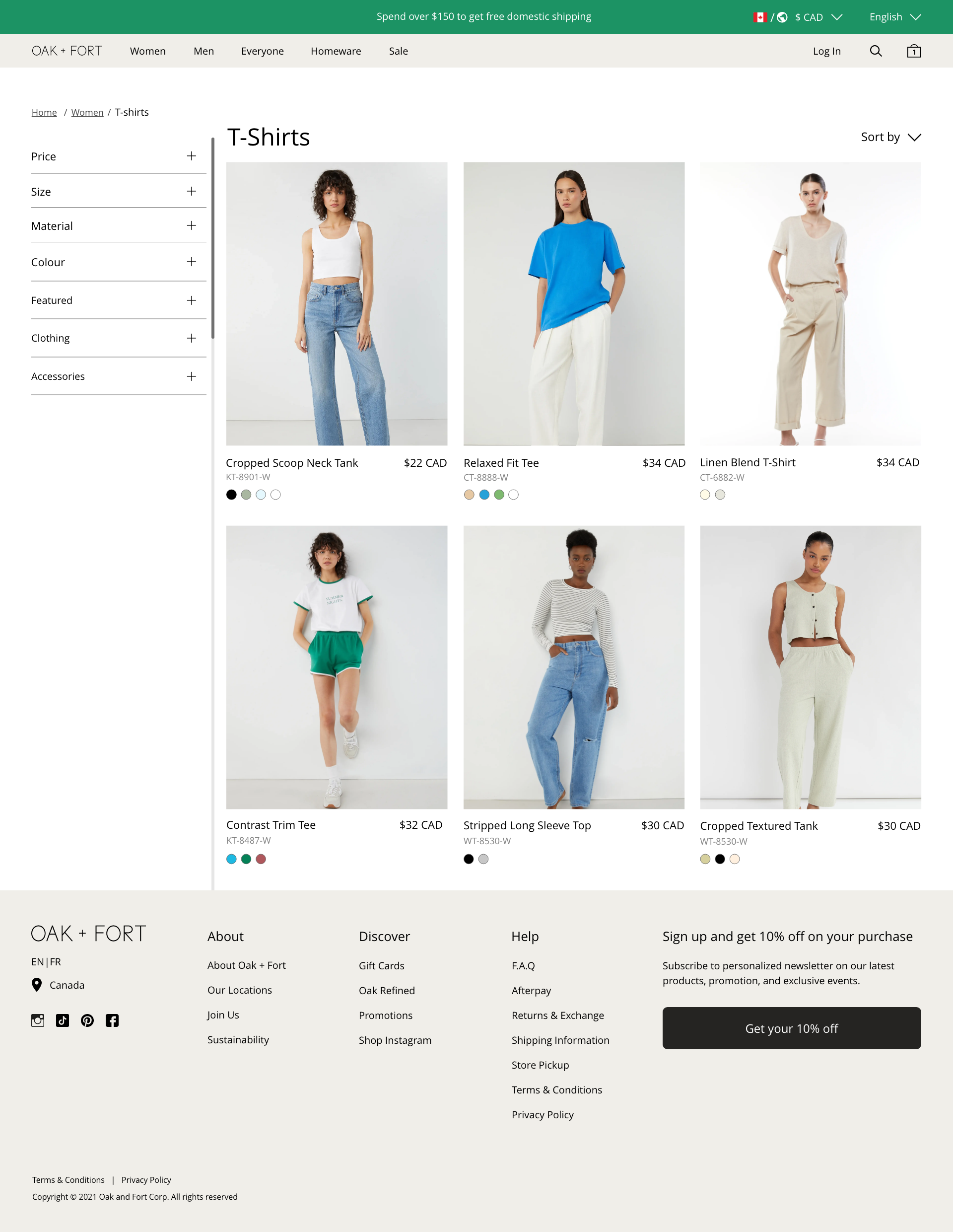
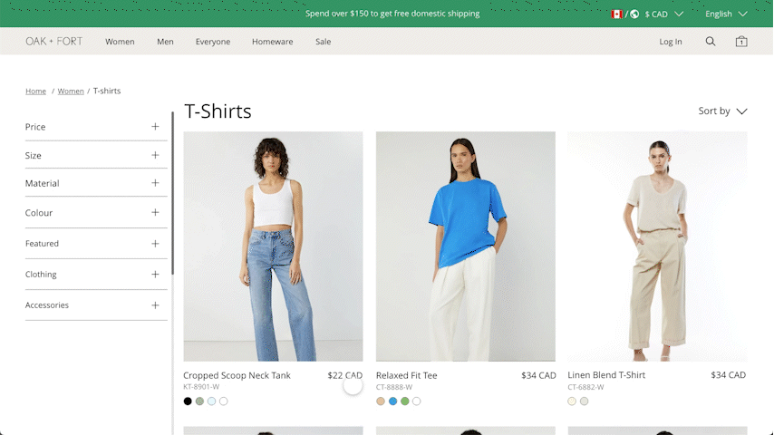
Product Detail Page
In order to make the product detail page user-friendly, all the components were designed with hierarchy and arranged in a way that made it easy for the user to perform the task at hand. The product images are adjusted so that they all appear the same contrast in order to provide users with a quick overview of the product from different perspectives.

Checkout
As a result of the usability testing, I have updated the checkout pages in order to make them more legible and efficient in completing the task. To make the checkout process smoother and easier for users, I added icons and visual cues.
I included additional screen size for mobile because many users are shopping online using mobile phone.

The initial high-fidelity prototype demonstrates the shopping experience on both desktop and mobile devices with legible typography, visual hierarchy, and user strategy.
Additionally, I included more images of different people on the homepage to make users feel included and represented. Furthermore, I have added a unisex section to the navigation bar as "everyone" to make the user experience more inclusive and to meet the needs of the business.
Desktop
Mobile
I conducted another round of usability testing to help me further understand the changes that could be applied to improve the user experience and design.

Express Checkout
Given the feedback from the third around of usability testing, I incorporated an express checkout feature that allows the user to quickly skip over entering customer information to reviewing the order details.
Quick Add Button
Another insight that I gained from usability testing is to make adding items to the cart easier and more efficient. So I implemented a quick add button where the user can add the product to the cart with just a few clicks without navigating to the product detail page.
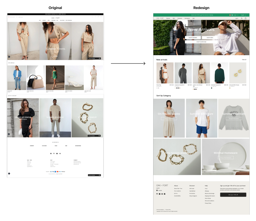
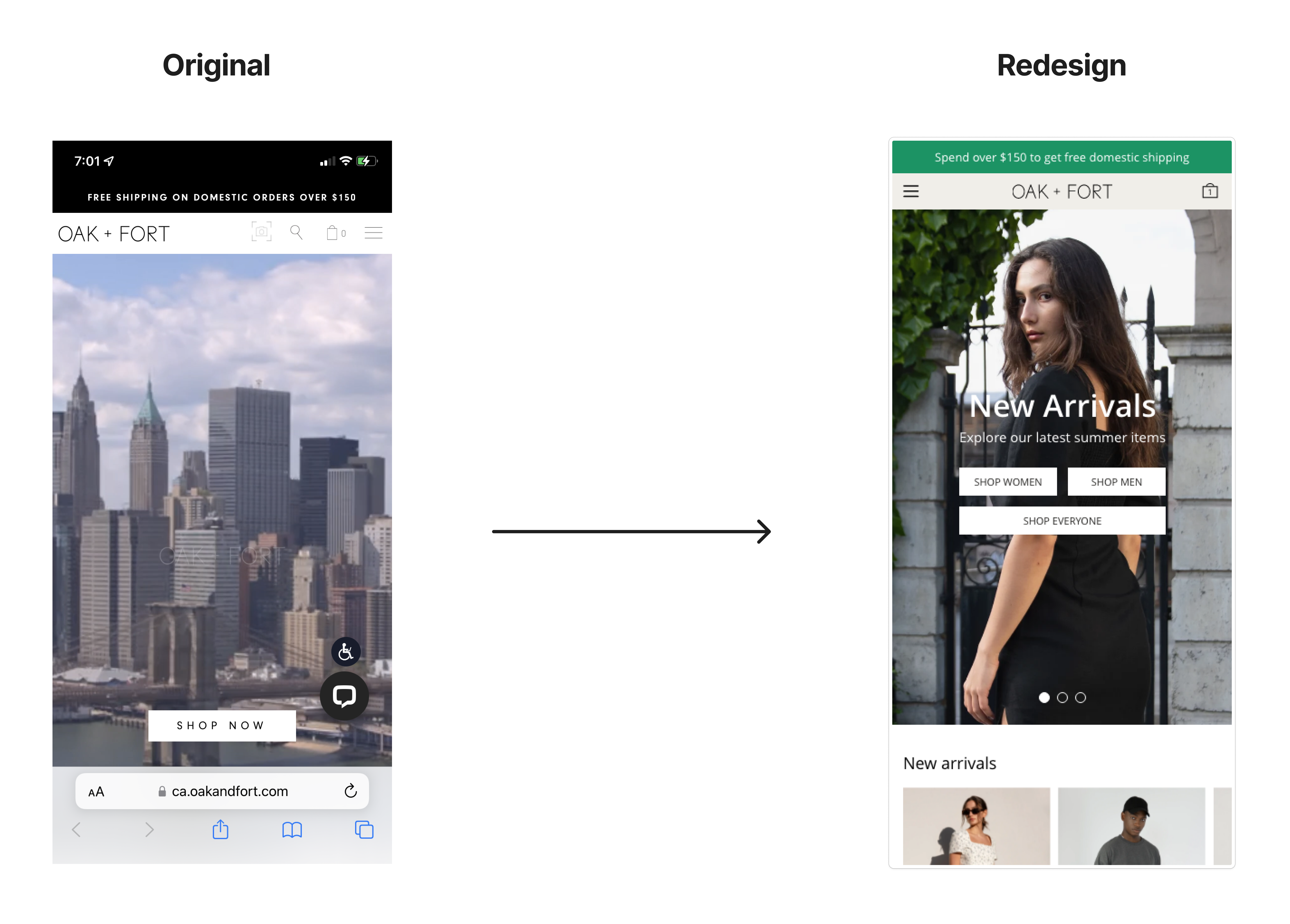
This is a comparison of the website’s design before and after. My goal was to improve overall readability, navigation and user strategy.
Desktop
Mobile
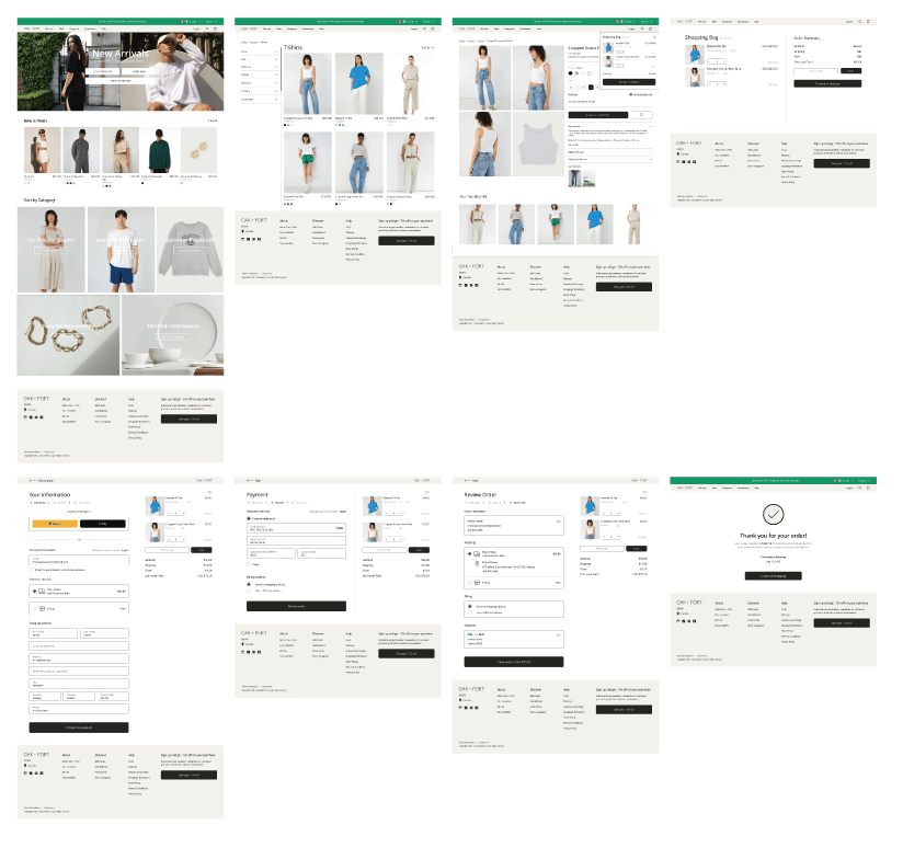
The final prototype demonstrates clean layouts, intuitive designs, and accessibility considerations to help users navigate and shop on the site easily.
Desktop
Mobile
01.
The user can add the product to the cart without navigating into the product detail page.
02.
Express checkout allows the user to skip to the last step and complete the order with ease.
When deciding the visual style of the app, I kept in mind that Lifely should be approachable and encouraging. Therefore I created a design system that demonstrates simplicity and well-being with green as the primary colour and a modern typeface.
I'm proud of how far the Oak and Fort website redesign has come, but design is a continuous process of improvement and iteration.
It would be beneficial to conduct another round of usability testing for a follow-up on the new website, making sure it is successfully meeting the needs of users.
It's always crucial to stay insightful and aware, so identifying any additional areas of need and ideating new features for users interacting with the website would substantially increase the overall user experience.
I did my very best designing the project making it user-centered while also keeping the business needs in mind, and I learned really a lot.
Our users shared that the redesign has made it easier to navigate through with legible typography, clear CTA buttons, and clean layouts with visual hierarchy. The homepage has also made them feel included by representing different types of people.
One quote from peer feedback: “The redesigned website is very easy to use and intuitive, it also made me feel that I'm being valued as a customer and I would definitely use it to shop clothes if the website was published.”
I learned that a small design change can have a significant impact on the user experience and how users perceive the product/service, such as representing a diverse set of demographics. The most relevant takeaway for me is to always remember to focus on the real user needs and how they interact with the product when coming up with design ideas and solutions.
